Horror Movie Swatches
One thing I aim to focus on this year a lot more is the importance of colour to establish a mood and themes in my work and why certain colours should and shouldn't be used it certain cases.
Lately I've been watching a bunch of horror/thriller movies and series and I've noticed the most ominous and chilling of them all use a similar colour pallet somewhere within them. The most noticeable colours seen together being blue and green. This wasn't really a surprise when I made the colour swatches (seen below) as most people already know this and use it within their work. However it got me thinking as to why these colours when seen together help contribute to the creepy unsettling atmosphere. Depending on the shade of the colours they'll inflict a different feeling within us.
A bright blue can make us feel calm, intelligent and trust. Whereas a Darker or more 'negative' blue can strike feelings of coldness, emotionless and unfriendliness. We as humans have also associated blue with bad times through our evolution. It isn't seen as a fun exiting colour but more as a stable or calm feeling. it's associated with water. As mammals we tend to avoid huge bodies of water (unless we're on holiday with our factor 50 and lilo in hand) as it could most likely cause our death if not careful. We've evolved to also be cautious of winter (also associated with blue) as it to can cause suffering and death.
The green colours seen in these scenes tend to be unnatural. By this I mean they're the appositive as to what we normally associate the colour with. Instead of rolling hills and wildlife we see the opposite here that gives us a feeling of enervation. Added to this is the colour have been dampened with a grey tone that we associate with lack of energy and depression. It also portrays lack of confidence so when used as the right time it can subconsciously help aid the narrative.


The last film swatch I created above from Alien Covenant adds more of the same unnerving blue tones in stead of the green tint but adds a small amount of dark red. With just one main colour switch the mood of the scene shifts, emitting more immediate danger to the viewer but still keeping the feeling of loneliness and dread from the blue tones.
Below I've displayed an original and an edited version from the same scene to showcase how getting the right colour can make an image so much better.
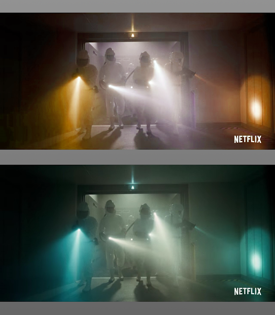 Although the lighting and shot of the edited version still give an ominous feeling, once you blur your eyes and leave it all down to the colour, they both take on different moods. The edited version now gives a more welcoming and warm feeling because of the orange colour that we associate with shelter and comfort. Whereas the unedited original does what its designed to do and gives us that unsettling chilling feeling that we all love to hate when watching movies or playing games.
Lately I've been watching a bunch of horror/thriller movies and series and I've noticed the most ominous and chilling of them all use a similar colour pallet somewhere within them. The most noticeable colours seen together being blue and green. This wasn't really a surprise when I made the colour swatches (seen below) as most people already know this and use it within their work. However it got me thinking as to why these colours when seen together help contribute to the creepy unsettling atmosphere. Depending on the shade of the colours they'll inflict a different feeling within us.
A bright blue can make us feel calm, intelligent and trust. Whereas a Darker or more 'negative' blue can strike feelings of coldness, emotionless and unfriendliness. We as humans have also associated blue with bad times through our evolution. It isn't seen as a fun exiting colour but more as a stable or calm feeling. it's associated with water. As mammals we tend to avoid huge bodies of water (unless we're on holiday with our factor 50 and lilo in hand) as it could most likely cause our death if not careful. We've evolved to also be cautious of winter (also associated with blue) as it to can cause suffering and death.
The green colours seen in these scenes tend to be unnatural. By this I mean they're the appositive as to what we normally associate the colour with. Instead of rolling hills and wildlife we see the opposite here that gives us a feeling of enervation. Added to this is the colour have been dampened with a grey tone that we associate with lack of energy and depression. It also portrays lack of confidence so when used as the right time it can subconsciously help aid the narrative.


Below I've displayed an original and an edited version from the same scene to showcase how getting the right colour can make an image so much better.


Comments
Post a Comment